How fairly paid are UK academics?


The last week has seen picket lines outside UK universities as higher education staff strike for "fair pay" in a coordinated action between three national unions. The Twitter-sphere saw a flurry of related activity as well.
I am not a union member and did not participate in the strike. I also don't care for the emotive language which tends to fly around when such issues are being aired. Nevertheless, the strike did make me wonder whether those of us who work in the higher education (HE) sector really have done badly in recent years. The union press release says that staff have "suffered a pay cut of 13% in real terms since October 2008", with the trend amounting to "one of the most sustained pay cuts since the Second World War". Strong words indeed, and yet no detailed evidence is presented to support any of these claims.
So I decided to take my own case as an example and investigate how my recent pay measures up to inflation, and to UK averages. There should be nothing that is unusual about my situation, since academic and administrative staff salaries in HE are worked out on a nationally standardised pay scale. Each point on the scale is worth approximately 2-3% more than the previous one, and pay awards which increase the value of each point by a fixed percentage are negotiated annually with the unions. The only variation is the so-called "London weighting", a fixed supplement that is paid to all staff working at London-based institutions, which I do receive.
To assemble the data, I started by taking pay information directly from each of my payslips since I was appointed as a lecturer, in November 2009. Since pay awards are often settled late and then back-paid, I updated the pay amounts each month to reflect their value including the relevant settlement. I then obtained up-to-date information on inflation and average national earnings (both Excel spreadsheets) from the Office for National Statistics (ONS), the agency whose job it is to obtain and collate such data. I then divided wage figures for each month by the consumer price index, the index used in official UK inflation figures, and standardised each ratio to a value of 100 in November 2009. The result is shown graphically below.
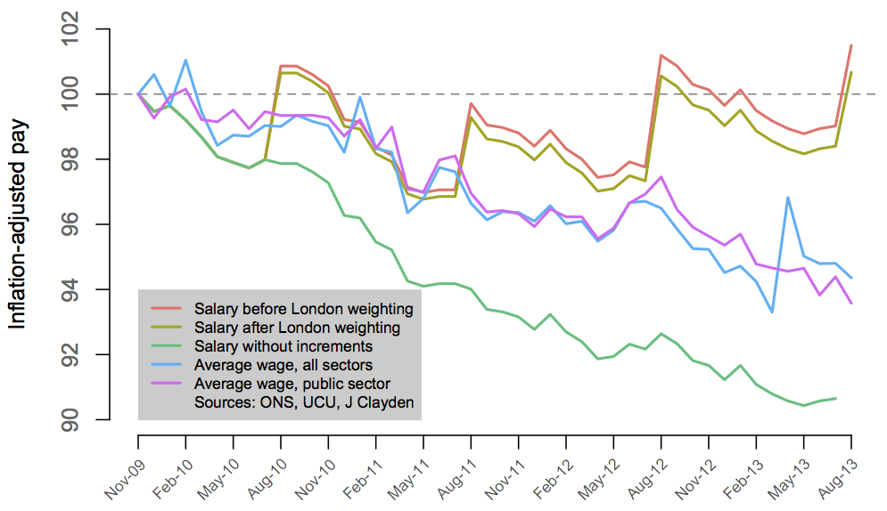
A completely flat line would indicate that pay keeps exactly in line with inflation, with no increase or decrease in real terms. Notice that, whether or not London weighting is included in the analysis, the lines corresponding to my actual pay (red and green-brown) hover, on average, just below the 100 line: in other words, my pay is very slightly lower in real terms that it was when I was appointed to my current post. There are substantial variations, but this is due to the fact that pay rises happen once a year, in August, causing a sudden jump upwards which is then steadily reversed as inflation erodes the value of that rise.
This slight decrease in the value of my pay over time is disappointing, but now consider the two lines showing average wages, as estimated by the ONS (blue and purple). These show a far more substantial and inexorable decrease over time: a drop of 5.6% in the public and private sectors combined, and 6.4% in the public sector specifically, over the period of less than 4 years that I've looked at. (These figures are seasonally adjusted, and so don't show systematic fluctuations during the year.) By comparison, a drop of less than 1%—as it works out when averaged over the year August 2012 to July 2013—sounds really not too bad at all. A 13% real terms pay cut since October 2008 certainly looks extremely fanciful.
The discrepancy almost certainly arises because the unions are choosing to ignore the fact that most HE staff usually receive an automatic increment to the next point on the pay scale each August, worth 2-3% on top of the national pay award. These are included in the jumps that you see in my pay data. Without them, things look a lot worse: the final line (green) shows a decline over time larger even than the average for the public sector, with the pay awards barely registering each August. The salary point that I was appointed at, was worth 8.9% less in real terms in February 2013—halfway through the last annual cycle—than it was when I was appointed.
In the absence of the automatic increments, the unions' 13% figure looks a lot more believable. Those who have been in the same role a long time, and have therefore reached the limit for increments within their grade, stand to come off worst as a result. I have no idea what proportion of all staff have been in that position over the last five years, but I wouldn't be surprised if some such people were amongst the picketers.
It's worth remembering that all of the analysis that I have shown here is relative to that November 2009 baseline. The debate here is not whether absolute salary levels in HE at that or any other point are reasonable, but simply how they have changed in the economic context of the last few years. As is so often the case, even this relatively simple issue is more complex than it first appears. For an individual staff member, whether they still receive increments is vital in determining whether their pay has more or less kept pace with inflation, or declined rapidly. Naturally, the unions focus on those who no longer receive increments, and the universities focus on those who do, both without really acknowledging the other case. If automatic increments were abolished pay awards would presumably be higher, but in the meantime there will be big variations between individuals.
The data (comma-separated values) and analysis script (for the R programming language) are available for anyone who wishes to reproduce this work. Please acknowledge me if you use them elsewhere. Twitter feedback is welcome (@jonclayden).