With the UK’s general election imminent, we, the electorate, have been treated to weeks of horse-trading between politicians on how much each party will or won’t spend on this or that if they get into power. £8bn more for the NHS here, £2.5bn extra for education there. Who would cut welfare? Who would raise taxes?
The problem with this—apart from its utter monotony—is that we have no meaningful yardstick by which to measure these brib… er, pledges. £8bn is a lot of money by anyone’s standards, but is it a lot compared to the NHS’s current budget? Does it reflect what the NHS needs, or has it just been pulled out of some policy wonk’s backside?
Besides, this money doesn’t grow on Whitehall’s rarefied trees: it ultimately comes from taxpayers (and creditors, since the government almost always spends more than it earns).
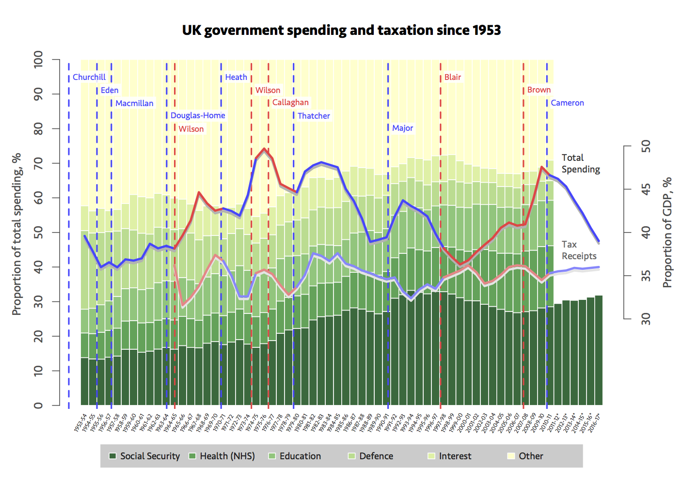
What I really want to know is, what is the right amount of spending in each area? But of course that’s a subjective question, and anyway, politicians only talk in generalities. I did poke around to try to find details of what the NHS spends its money on, for example, but I couldn’t readily find figures in a useful format. What is available, is historical data on government spending. The Guardian’s Datablog has helpfully collected data on public spending from various sources, going back to the 1950s. The more recent numbers are not up-to-date, but it is still very informative. The chart below is my own visualisation of some of that data.

There’s a lot of information here. The blue and red lines show overall taxation and spending, while the stacked bars show how total spending is divided up by category, year by year. Clearly, these categories are not exhaustive, and so a lot is bundled up into "other", like transport, and law and order.
It’s not the most exciting or dramatic chart you’ll ever see, but there are some interesting aspects to it. First, notice that social security and the NHS have consistently increased as a proportion of overall spending, with only fairly minor exceptions. Education has also increased, though more modestly. Defence has dropped from over 20% of spending in 1953–54, to barely 5% in recent years, due to gradual reductions in the 1960s and 70s, and after the end of the Cold War. All of these long-term trends have continued more or less irrespective of the government of the day.
Overall spending and taxation levels generally don’t go hand-in-hand: often one rises or falls without the other. In the Blair and Brown years, spending and taxation were initially closely matched, but as time went on, spending increased substantially while the tax take stayed fairly constant. On the flip-side, big drops in spending are clear during Thatcher’s second and third terms, and during the current government. But data on the latter is not current in this dataset, and updating it would have been too time consuming for me to do—even if the data were all available.
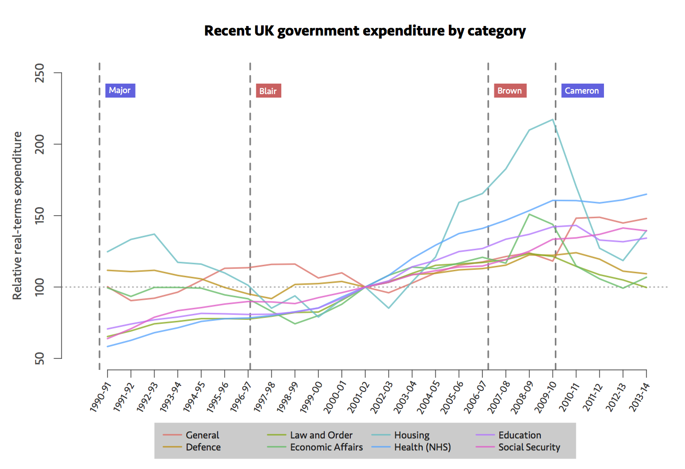
Fortunately, more up-to-date (but less historical) information is available from the Treasury’s Public Expenditure Statistical Analyses. Let’s have a look.

The NHS really is unstoppable, which is hardly surprising given the lip service that politicians of all stripes pay to it. With only a tiny aberration in 2010–11 and 2011–12, it has seen inexorable real-terms funding increases since 1990. If it really is in “crisis”, as we sometimes seem to hear, then, well, it’s absorbing a lot of money in the process. Housing, which includes “community amenities”, has seen wild fluctuations, and very sharp cuts during the Cameron–Clegg coalition government. I’m not sure exactly what this is accountable to. General includes debt interest here, which may explain the recent jump. Education, defence, law and order and economic affairs—which includes a hodgepodge of enterprise, science, agriculture and transport—have all decreased in real-terms since Cameron became prime minister.
But notice that, as of 2013–14, every category here is at or above the level of the reference year, 2001–02, which corresponds to the beginning of Tony Blair’s second term. All but defence, and perhaps housing, are higher than in the Major years.
We still can’t tell what the right level of funding is—that’s really a debate that should be had, and very much in public. But it’s important to consider what spending pledges are being made relative to. And in some areas, the mid-to-long-term trends may not be what we expect.